Ahoy hoy!
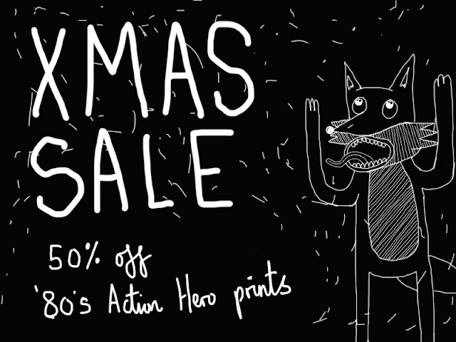
Over the past 3 or so months, I've been working on my own illustration series: Action Heroes from the 1980's. Which is mainly the reason why this blog is a bit dusty, but I'll make up for it by doing a longer-than-normal post you lucky reader.
Also in this blog post I wanted to go about explaining the creative process as it's something I do like to analyze and deconstruct. Quite often the process or journey gets overlooked in favour of just what the end product is, and I don't think that's always fair as a lot of different tangents can occur from the conception of the idea to the final product.
So yeah, I wanted to do an illustration series for ages but really couldn't focus in one topic that I enjoyed and wouldn't get bored of doing. It varied from film artwork, video game characters, football artwork, food, music albums and lots more. Then it occurred to me that action film's in the '80's not only had bad-ass protagonists but also had amazing lines and quotes. From this I did a quick poll on one of my Facebook statuses asking who was their favourite protagonist so that it wasn't biased just to my taste (and turns out that everyone who replied has great taste). Plus, I wanted to make something that others could potentially enjoy rather than make something for my own sense of satisfaction.
The final 5 heroes chosen were:
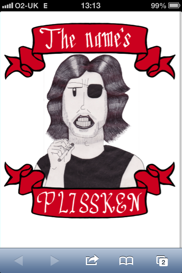
Snake Plissken (Kurt Russell) from Escape from New York
Ellen Ripley (Sigourney Weaver) from Aliens
Peter Venkman (Bill Murray) from Ghostbusters
John McClane (Bruce Willis) from Die Hard
Han Solo (Harrison Ford) from Star Wars
In terms of style, I wanted to go down an exaggerated grotesque/grim look in a hand drawn style. I thought I'd draw everything out by using 2 pens: Black biro for hair, shading and tones. Black 0.5 Muji pen for solid colours and outlines. And from here I can always touch up digitally.
Starting off with Plissken, I've actually drawn Plissken lots of times before (one of my favourite heroes and films) and you can see a smaller version of him in the little sketchbook in the top left of the photo.
Working out hair tone and shape.
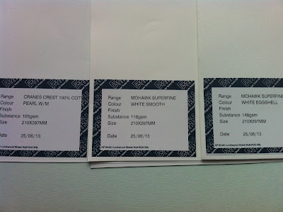
A very important factor I started to consider when drawing out the action heroes is to what type of stock I should use. I've always gone with paper mill
GF Smith as they do absolutely beautiful paper. Anyone who knows me very well in a creative sense can concur I'm a huge paperphile. I can quite happily hold down a detailed conversation about paper. Yep. It's much more interesting than sounds (trust me).
Anyway, I have the GF Smith sample book which showcases all the different stock they do. I wanted something off white, slightly cream with a coated texture so that when the ink is printed onto it it doesn't make a huge contrast with the paper. The benefit of a coated paper is not only for tactile purposes but because of the printed effect it gives - it leaves specs untouched which gives an almost 'fuzzy' feature which I really like.
In terms of the 'gsm' (for those not in the know: 'grams per square metre', meaning the thickness of paper is actually measured by it's weight), I needed to go for something that isn't very thick so it can cope and fit into the printer, but nothing that is too flimsy and delicate. Think of it like this, plain paper that you would use in day to day life is normally around 60gsm - 90gsm and traditionally 'card' is about 250gsm + (Also, there's a huge debate about what actually defines the difference between paper and card, but oh boy! That's another conversation for another time kind reader.)
I requested 5 different A4 samples from GF Smith to have a closer inspection. Three of the samples are in the photo above and I subsquently went for the for the far right sample, called: 'Mohawk Superfine white eggshell @ 140gsm'. I ordered a batch of this at an A3 size.
Told you I can talk paper.

McClane.
Drawing up Ripley.
I struggled with the typography for ages, initially I was going to do it digitally, then hand drawn, then digitally - but then what style? Same for each? Different for all? It was a lot of things to consider, as you can see above I experimented with a style that closely resembles the film. But then I thought what's the point? We already know the films style having watched it or by knowing the characters. How can we differentiate the film (and other existing film artwork) from something I've done? I scrapped this hand drawn look and decided to do it digitally, but in my hand drawn style.
The two examples above were my first digital composition drafts. I struggled for a bit where to go from here and what to address first. The typography was just a draft for now and I knew I would do it more detailed but wasn't sure how, also, should I include textures on the banner? Add another colour? Make the action hero larger or smaller? etc.
I then accidentally did the red monochrome version and I quite liked it. I was planning on doing a certain colour for each action hero anyway, so this might make a nice feature (especially as a set) if they were just monochrome prints. Although I wasn't convinced, I was at artistic crossroads. I had been staring at the screen for ages and had analyzed it for so long. I needed new eyes.
I enlisted some advice from my comrade
Leo who has a very good eye for art direction.
In summary:
'Lose the monochrome, add a bit more Jamie flair to the banner, blend more, iron out the details.'
Which was actually great help, massive thanks.
He also suggested to add more to the background, like lines or cross-hatchings. I loved this idea as a lot of my
past work has this element in it and seemed strange that it didn't naturally occur to me to do this.
Anywho, I gave it a go and it didn't work out very well. It made the picture much, much busier than it needed to be and you lost the concise, hand drawn detail of the original drawing which is what I wanted. It's a shame but less is more in this case.
As you can see from this draft I got a better idea for the typography - in which I chose to do calligraphy. I've always enjoyed this method of lettering and my natural handwriting is like a less fancy version of this, so not only is it easier for me to do but it gives it more of a personal touch.
All the lettering is done in a calligraphic style, but with each different action hero the calligraphy differs. I wanted to keep an overall style consistent but make subtle changes to the letters and characters to make the calligraphy more relevant, as certain quotes have different tones and emphasis.
First test print on plain paper, not only testing the best printing presets but also to see if there were any details I have missed and needed to edit.
And sure enough I needed to make some adjustments (the areas marked in red pen). Once I finished this it was time to print off a proper batch.
Here's the final Plissken print finished. I'm very happy with the outcome.
These prints are now available to buy on
my shop have a look and a browse. They're £12 each, and it's free postage but only UK shipping for now.
Depending how successful or what type of feedback I get I might do a series of 1980's villians, but like I say we'll see for now.
TTFN