Sunday 16 December 2012

Stereoscopic Portraits ii

Experimenting further..


Steve, North Star.


Louis and Steve, Picadilly Line.


Kit, White Swan. 


Dave, Alex and Will, Kings Cross. 


Ben, Tom and Steve, The Lamb Brewery. 


Adam, N11.


Monday 10 December 2012

For Arts Sake A-boards.


This is the A-board I've designed for November. An exhibition showing the works of Barbara Rae, Donald Hamilton Fraser, Dan Baldwin and Brad Faine.


This is the Christmas A-board, I couldn't take a photo from the front as there was massive glare at the time of the day of the photo. I'm quite pleased that I feel more at ease with my use of typography and I think it's improving. I'm really digging '50's vintage design at the moment.

Smell ya later.

Sunday 2 December 2012

Pinch TV - Ghost Owls.

Here it is!
In a post I mentioned prior I had been working with comedians Matt Bell and Rob Hoey for a Pinch TV comedy collaboration. Here's the result, rather than embed the video itself it's worth clicking on the actual link as you get to visit our artist profiles as well as check out the schuper schlick Pinch TV website.


Pinch TV comedy collaboration - Comedian actors  Matt Bell, Rob Hoey and illustrator Jamie Kyle.


Oh Sean! Classic.

Sunday 25 November 2012

Wednesday 14 November 2012

Stereoscopic gifs.

As a gif connoisseur I always like to experiment with the format. I played around in my final year at Camberwell trying a technique called stereoscoping, which is otherwise known as 3D filming. Well, it's 3D filming but without the 3D glasses, it's the same idea of having two cameras representing each human eye at different distances or angles. In my instance I experimented with angles.

I first saw this technique being used in this music video and I wanted to emulate it the best I can.  I experimented with angles in the film I did at Camberwell and it can be seen here in about 06.55 being used for a dream sequence. It worked well for this cause but editing it in film format was painstakingly long and memory/RAM heavy.

I got re-acquintated with these 3D 'wiggly' gifs browsing Reddit and thought I'd give it a go again, some interesting results and I would like to do more.

(Quality may be a bit fuzzy as taken on my iPhone and I had to majorly reduce the file size)


An interesting thing I noticed is the timing between frames that I set. The black and white gifs have no time delay but the third and fourth have a delay of 0.1 seconds. I think the timing all comes down to the actual content - 0.1 for more scenic shots and no delay for something that is action packed and has a lot going on in both foreground and background (a gig for example). It's also important how many angles you take, the last one has 3 angles and the rest only have 2.
The more angles = less time delay you need.

Next, I'll like to try some portraiture shots, so a minor warning to my friends that I may be quite insistent of taking your picture in upcoming meetings.


TTFN

Sunday 21 October 2012

Tube map design.

Earlier in the week my Father gave me these old school tube maps, he works for the print company Colour Five and recently got a job in from The London Transport musuem, who wanted to re-print some of these old bad boys. They're fascinating. The way the London Underground has evolved in terms of its network and design is pretty impressive with each map becoming more and more concise. I like to think that this reflects attitudes towards design, communicating ideas and messages efficiently as well as being coupled along with modernism at the time. Intriguing that the first two are very accurate in terms of London geography and they look like they've been hand drawn. Obviously the most modern tube map isn't to scale or accurate but designed merely to be clear and easy to understand, essential information design.

The covers are quite interesting too, some having maps of areas, lists of theatres and places of interests. In contrast to more recent times it's very different as I remember my favourite illustrator David Shrigley designing the cover a couple of years ago.

Some other interesting points are that the tube lines weren't always the same colour as we know them today, Central line used to be blue then changed to orange before the red it is today and Bakerloo line was a fabulous pink. The main thing I quite liked was the now abandoned and closed down stations that are shown, including: Uxbridge Road Station (which was between Shepherds Bush and Holland Park), Post Office Station, Addison Road Station and Praed Street Station to name a few.

If you like information design like me, this is the jazz right here:

Clickity click for a closer look.


 Issued 1908


Issued 1926


Issued 1933


 Issued 1938


Issued 1949

Friday 19 October 2012

Bottle Design.

While I was at London College of Communication - UAL, you may be shocked to hear that I majored in illustration, my minor however was in information design. It's something that I've always found fascinating and ranges across a wide spectrum including books, album covers and signage to name a few examples.

I dabbled across these areas, but an obsession soon began to creep in. It started when we had a trip to Paris to have a mooch about and pop into a few design agencies. It's absolutley killing me but I can't remember nor find the name of this one agency we went to (LCC'ers feel free to help!) but they designed the label for the Belgian beer Vedett. They had this one idea how people would submit photographs of themselves and they would print it on the label like this. Genius idea, they still do it for special custom orders via their website which is worth a visit as it's very sleek and sexy.

I love this, I loved the idea of making something like a bottled good look very cool, so I started an experiment. I purchased bottled goods based purely on their design, yellow tail was one I vividly remember as I type this. The result and general rule of thumb was that if it was nicely designed in a cool or unique manner then the product itself usually reflected this too. If you buy something that looks cheap (price wise too) you do taste the different. This also reflects the people behind the brand, good design, good taste.

Give it a go, buy a bottled product just because it looks cool. You may end up spending a fraction more (not an awful lot though) but it'll be worth it. You're bound to come across a few pretentious looking ones that fail miserably to what I've just said, but the majority of the time it does work. 

I realize that this sounds incredibly obvious but label design for any bottle is integral to the brand, I've always liked to think that the label is what the product tastes like for the outside of the bottle.

I'm going to document a few findings and submit them here in bunches, I'm not going to deconstruct and analyze the design. They're here because they're bloody cool. Submissions are welcome too, would love to see what others find.


Saturday 8 September 2012

Recently..

I've been working a lot at the gallery in my extended role and neglected this space, so I decided I would do a post about the design aspects I do at For Arts Sake. I'll start with the a-boards. I design visuals for the a-boards, an a-board is basically a double sided poster in a typically wooden frame that stands outside the gallery (I did a post about the Mother's Day a-board which went down a treat) The most recent ones I've done are:


This was our Olympic a-board, offering discounts in the form of medals.


This a-board went up earlier in the week, was really pleased with this as I just wanted to create something simple and bold for our newest exhibition based on London.
(Better pictures of both a-boards here )

I also completely forgot I did this little hand-drawn sign for Father's Day. I've been trying to teach myself calligraphy which is a bit stop and start at the moment but I thought I'd give it a go on this. 
It turned out fairly alright although I was a bit gutted it was thrown away straight after Father's day!


Pencil outlines.


Typically you would use a proper calligraphy pen but I pulled it off fine with a big ol' juicy marker.


I just wanted to post this little video up too, it's one of my new roles at the Hendon workshop in which I use the mount cutter for framing jobs. I've become used to it now and you get a great sense of satisfaction and achievement when you understand how a new machine works. I made loads of mistakes to begin with and feared I almost broke it on a couple of occasions or that it was about to explode - it uses a compressor which you have to switch on/off to relieve pressure for it otherwise it will actually explode which wasn't a great thing to be told when I would be working by myself the following day.. 
So I always had an anxious wait/half of my foot out the door whenever I turned it on as it would go like 'ffffffffffffffffffffffffffiiiiiiiiiiiiiiii' for a couple minutes then 'POMF' when it was done. 
The 'POMF' was the worst part. 
Just as you're getting used to the 'fffffffffffffffffffffffffiiiiiiiiiiiiiiii' in the background the 'POMF' would interrupt like an annoying dangerous friend. Make you jump 3 feet in the air and then you open your eyes to reveal that you're still alive.. close call this time..

One of my other main roles is now bringing For Arts Sake into the 21st Century by fine tuning them into the world of online social networking. The blog I set up has made good progress so far and can be found here . Also, the Facebook and Twitter accounts have been developing at a steady pace so please check them out.

But yeah, I've had a few job offers recently which is great as this summer has been a very quiet period in terms of freelancing, just realized it was about this time last year I was assisting on that Samsung animation. So there'll be more exciting news to follow soon, smell ya later!


Thursday 30 August 2012

Episode One - HMS Crown.

Hello hello.

Been a bit quiet recently, I've been working on this video with comrade Keir Carroll. This is our first episode of a surreal series we would like to do, playing to our strengths and showing off our skills. I hope you enjoy:


Saturday 4 August 2012

St Ives.

Hello.

I came back from a lovely break in St Ives yesterday, I usually take this opportunity to do more of my photography work but this year I wasn't in that exact creative mindset, I had more of an urge to draw (which is great!). Did a few silly sketches and revisited some landscape drawing which it only dawned on me that I've always done this type of drawing even from an early age. Here are a few doodles:


On the scenic train journey down just before we stopped at Plymouth I saw this idyllic pocket of land next to a river. The building was this small stone structure with 3 metallic gates and what I can only assume was a pagan symbol above the central gate. Completely untouched and resting upon this small hill and absolutely surrounded by trees. It seemed strange that this was obviously quite isolated from everything else but yet very visible from our train carriage.


The title is pretty self-explanatory really.


Seagulls are horrid.


Honestly, they really are, the only negative aspect of Cornwall in my eyes.


I'd go as far to say that I prefer London pigeons over them.


View from Porthmeor beach 1


View from Porthmeor beach 2


View from Portmeor beach 3


(L-R) My brother Matthew and my sisters Hazel and Eden.

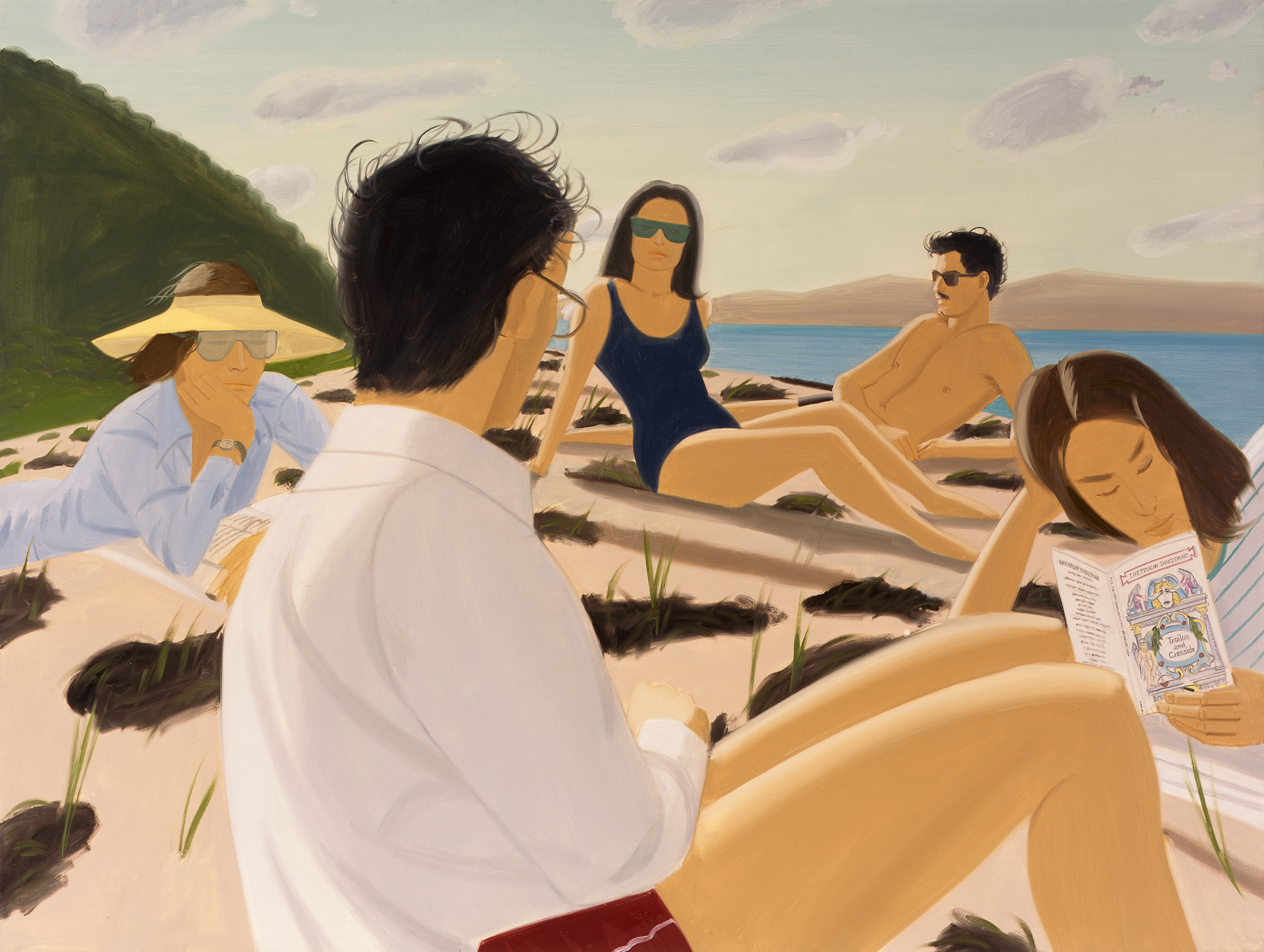
After going to the fantastic Alex Katz exhibition at Tate St Ives I was drawn to replicating his sketching style (example just above) - it's something I often do when I come across an artist I like, 'you have to speak in a lot of different voices to find your own' kind of thing. It's a similar process to singing one of your favourite songs for example.

Anyway, his method of sketching in particular was to draw and not to think, so that you can create a fluid piece of work without obsessing over minute details. Beside his sketches I was absolutely fascinated by his paintings, he was one of those artists that just seemed to click with me. It makes the experience much more enjoyable when you 'get' an artist and what they're about. I found it surprising that he came about in the 50's when Abstract Expressionism was at its peak and was going against the likes of Pollock and De Kooning.

The paintings in particular, for me anyway, had this great element of being like photographs. Especially his paintings of when he went on holiday various years with his friends to Maine. He managed to capture these intimate moments with his friends very much like a photograph does, which instantly draws in a nostalgic element (which is always a strong tool) but the use of his vibrant colours gave it a timeless kind of feel. Here's a good example. I realize that almost sounds like an oxymoron but have a look at his work and hopefully you'll see where I'm getting at. All his paintings had a very strong sense of 'film' like you could imagine a lot of the work being used for advertising and used in general today. He turned 85 this year and is still working.
If you're in the area, I really recommend having a visit.

TTFN

Wednesday 25 July 2012

Ealing Olympic thing.

Yeah I went along to it, might as well if it's round the corner from your house right? Great weather for what was a huge build up and predictably an anti-climatic finish, got a bunch of free stuff from the sponsors. I kinda felt sorry for the guy lighting the thing. He was clearly knackered from the run and then was bombarded by a children's TV presenter "SO HOW DO YOU FEEL?!" "Um, yeah alright..".

They took a huge photo, I couldn't resist.


Yeah, take that, corporate events! 

Saturday 21 July 2012

Gerald the Bear.

I was clearing out some old folders and came across this comic I started, I have no idea why I stopped doing it as I loved the character. Anywho, I polished off a few details and finished the text so here it is! May do some more. 


Friday 29 June 2012

For Arts Sake.

Hello Hello,

Well, I've been working at the gallery 'For Arts Sake' in Ealing for just over 15 months now, my role has developed so that I do a couple of days down in the Hendon base where the workshop is situated. I'm a spare pair of hands but I get to do more design based work and get to use our lovely huge printer as well. My role has developed also in the sense of social networking, we've created a Twitter account and a blog for the company so that clients and customers can have a more direct link with us and give everyone a better idea of what we do as a whole, as we aren't just like any other gallery..

If you could be so kind and give the blog a little look here: http://forartssakeuk.wordpress.com/ and perhaps a little follow on the Twitter too?

Ta

Jamie

Translate