Showing posts with label logo. Show all posts

Thursday, 9 April 2015

The Scratch Cards - Part Four.


Right! Part Four! If you need any catching up here is Part One, Part Two and Part Three. Here we go:


I got in contact with a company called Dirt and Glory, based in the Havas Work Club in London Bridge. They had an exciting new role as a Social Media Creative which sounded like the type of gig I was looking for. I met with the co-founder (they're literally a company of 2 right now) who was very pleasant and an added bonus he was a Gooner! They needed a creative type and I seemed like the perfect fit - clearly impressed by my scratch card project and saw the potential I could bring to this sort of role. They wanted to bring me in as the 'first man of the hour'.


It sounded exciting, it'd be part time so flexible with my own work, a decent day rate and exciting projects on the horizon. Could this be it? I left the interview with the conclusion that an offer will be sent over the weekend and we'd go from there. Jolly good, off on my way to a merry weekend.


Continuing my search (always safe to cover your bases) I was pointed in the direction of Whistles thanks to my pal Chloe - they were looking for maternity cover for a Junior graphic designer role - I had a solid telephone interview and was invited into their head office for a more in depth one on one interview - which seemed to go down very well and I felt fairly confident about it afterwards.

It was similar to the majority of roles that I've been applying to - digital design that is needed and popular for the requirements of todays modern companies. Work like layouts, web stuff, mock ups, product shots, touching up etc. For the most part and forgive me for sounding blunt, I don't find this very entertaining. However, an opportunity to learn and develop on skills should never be dismissed.

I'm by no means a natural choice for these kind of roles as my background is more of a left wing one stemming from illustration and design. Which unfortunately is likely to go against me - but I think it's important to maintain an element of individuality in your work rather than just be a 'Mac Monkey' like the rest of the designers out there looking for work.

But nonetheless, you should keep your options open.


I was tucking into some new beer label designs for Hellsize Park Brewing Co. on a Friday night when my email icon spun into action. Surprised and curious, I opened this rogue email straight away- who sends an email at this time? Shouldn't people be out socialising and doing things? He said, lurching over his laptop and tablet in dim lighting. To my surprise, an animal had got in touch called Stevie. Stevie The Fox to be exact.


Now, if you hadn't heard of Stevie The Fox - it's on trend with cafe's of a similar theme that are featuring animals. You heard of the cat cafe's, owl cafe's and yep, you guessed it - this was the Fox one.

They needed me. They came across my work and noticed my enthusiasm for foxes - they saw me as a perfect fit to design their logo for their shop and merch. I jumped at the chance. They needed a logo for Monday morning. This was an incredibly tight turnover but in my excited state I churned it out in record time by Saturday afternoon, much to the delight of Stevie. The logo is below:


A few days past and I was super excited at the prospect of my shiny new logo being on a cafe front and on various merchandise. Look at me, all shop front famous. 

But unfortunately for both Stevie and I, bad news struck. Stevie up until this point had overwhelming attention, a mixture of excited glee of the idea of playing with some tamed foxes, (and a few other critters too) excited curiosity and concern.
The concerns over the welfare and safety of the animals for their duration in this East London cafe was rising, in which campaigners against it assumed it would take the form of like a Cafe Nero with a few cages thrown in. Matters got out of hand, as campaigners got louder and ultimately compromised poor old Stevie, he was left with no choice but to shut down this exciting project before it even opened. Stevie goes on to talk about it more here in this blog post explaining why he decided to close.

There was certainly no malicious intent behind this project, but never mind, life goes on. I'm sure this won't be the last time we hear of Stevie The Fox..


Back to the search, a couple of weeks had passed and there was still nothing concrete from Dirt and Glory, had one phone call saying that we're still both keen to get things rolling - but nothing serious yet.. Granted that a small start up business will be extremely busy but time's getting on. There's only so much waiting one can do..


A few days ago I was hanging out with my good buddy Will and I got a buzz from my gmail app.

It was an email from the creative team at Innocent, they're back! They want to meet...


To be continued in Part Five...

Friday, 3 October 2014

Jolly good update!

Aloha!

So, my blog posts have more or less developed into a summary of recent projects rather than posts about individual ones it seems. I'm not sure if I prefer this method but it this is how it's developed organically in recent times with my workload so it is probably quite appropriate in that sense.

Huzzah!

Down to business, let me give you the skinny, kind reader:

Data Tech Services

I designed a logo for a good friends new IT company called Data Tech Services. This is probably quite formal for me in terms of project branding, as it's almost quite corporate. However, you only learn new skills and experiences when you push out of your comfort zone so thought I'd embrace it.
The company is about security and data, so looked into common icons, symbols and themes that relate to this. I doodled away a few thoughts and settled for the final look below, which myself and my clientate (a term I've coined for someone who is a client and a mate) are both very happy with.


Kids with Puns

I was approached a couple of months ago to submit work to a magazine called Kids with Puns, a magazine specializing in puns and word play. Anyone who knows me well or even just a little bit, knows how much of a sucker I am for bad jokes and puns in general, so I jumped at this chance and had a lot of fun with it. This was for the 4th issue of the zine, go and check out the glorious madness of puns and maybe buy a copy for £3. G'wan, that's like half a pint in most London pubs!


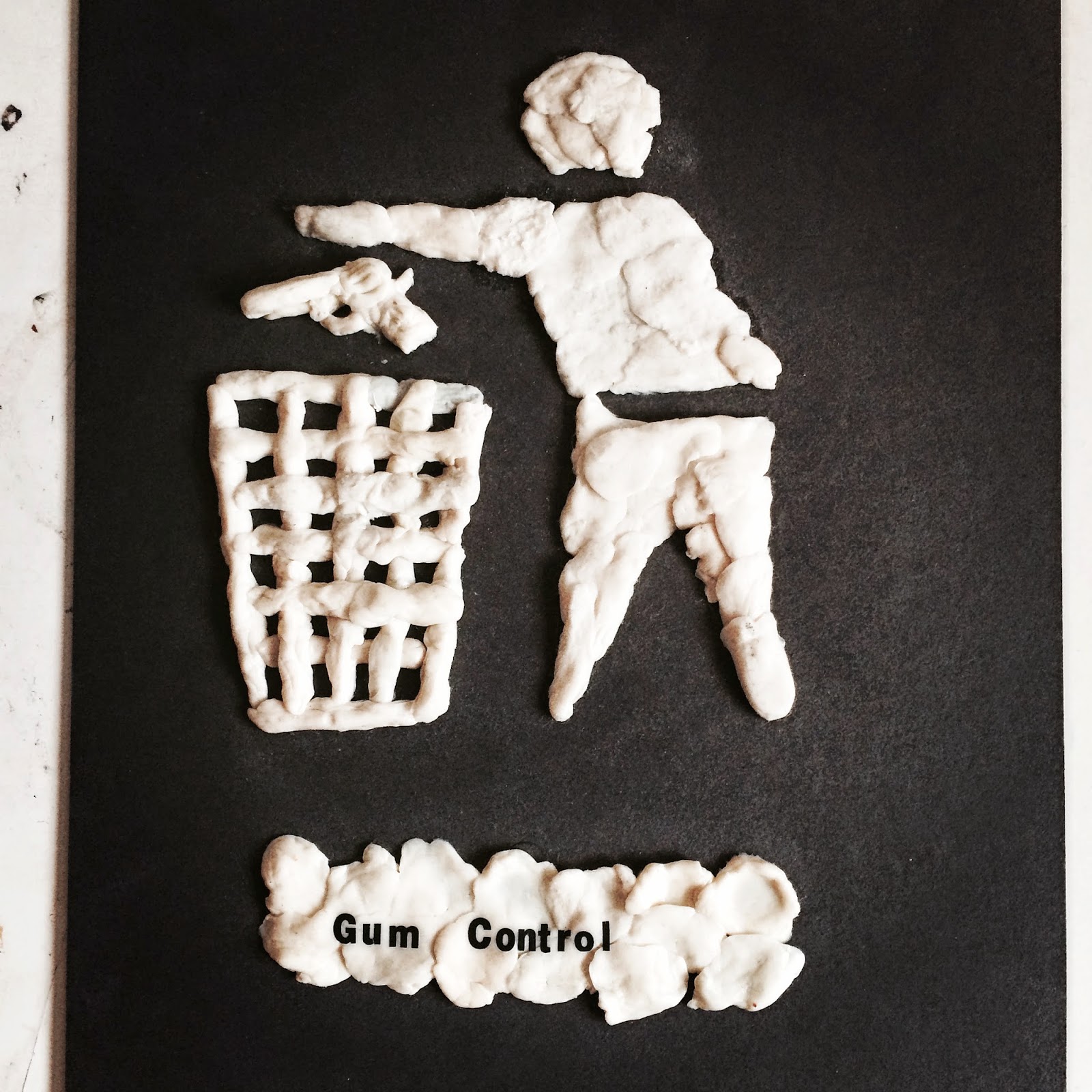
Gum control

This is my second gum artwork of my planned 'Gums and Puns' trilogy (click here to view the first one I did a couple of months ago). Touching on a similar subject issue as the last one, this time using the gum as more of a basis of imagery, using the iconic semiotic of the recycling silhouette. It was really fun to get a bit more creative and hands on with the gum, I have a feeling the third and final installment will push this element even further. Stay tuned.


That's all for now folks, until next time!

TTFN

Sunday, 6 April 2014

Tellers artwork.

Hullo.

I've recently designed some artwork for the band and good friends Tellers.

Having been to a few of their gigs I always had a vague idea that a repeated linear artwork would really suit them, stuff like waves/optical illusions close to a Bridget Riley style (who I've been a massive fan of since Year 7 art class). The idea of simple lines repeating themselves to make a grander composition is a lovely and intricate idea. The band touch on a Math Rock genre, which has it's emphasis on complex layers so I knew this aesthetic would go down well.

So from here, I looked at similar themed bands to get an idea of styles and trends, a lot of them had this style of geometric shapes, tessellations and detailed illustrations, which is right up my street.
As a sucker for word play I thought I'd play around with the Math aspect a bit more. At design school it was ingrained into us that when it comes to composition, you must always consider the rule of thirds and the golden ratio. Now, the golden ratio is intimately interconnected with the Fibonacci sequence and from this I remember there was a spiral in particular using this rule, it seemed pretty obvious that this was a good place to start.

So I played around with it a bit, did a few variations including different fonts but we decided to settle with the original logo. Here are a few of the initial ideas:


I added the logo in the last one to give it a better visual context. The guys liked this one so I developed it into a few different versions to make sure all aspects were covered. After a few adjustments the band decided that the this one was the best one to use. They wanted the logo to be made a bit larger which I was fine to do, there's an inside joke that clients generally ask for their logos to be bigger, here's an article that talks about it.


Since this will be predominately used on their web profiles and social networks, it does make sense for the logo to be a bit larger - think what it would be like as a thumbnail image - no point of having it smaller if the logo is too small to actually read. I can feel my ears burning as typographers will be casting a menacing eye over the centering and where the top left of the 'T' lingers over some of the artwork - the logo is right orientated so is a bit asymmetrical, not necessarily a bad thing it just means it won't be bang in the middle. Here it is:


Very happy with this, the band have released their EP this weekend, which I highly recommend. They were also played on the 'BBC London introducing..' radio show last night so congrats on that!


Click here to check out their awesome EP.


Here's their Facebook and Twitter links. Soundcloud for good measure too.


Toodle do.


Translate