Hello hello,
Recently I've been exploring current themes and ideas that seem to be trending in the world of design and illustration. A common theme I have noticed in particular is type in the form of 'sayings', imagery and quotes. These have made quite a surge in the form of interior design and decoration. I decided to play around with this and see what I could come up with.
The initial danger of doing or creating something in trend is that it's soon going to be outdated. I wanted to adapt this current theme and put some legs/layers onto it. This in turn bodes well for my love of word play, puns and visual jokes.
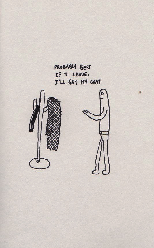
I've come up with the following ideas, as I've mentioned before I really enjoy discussing how ideas generate and develop, so bear (grr) with my incisive annotations. They say ideas should speak for themselves rather than need to be explained and I agree. But I see this like how you would see a TV series or a film. You like to discuss how things happen, why they happened, how they could've been done differently and who killed who.
So let's jump on board! Keep your hands in the cart at all times:
The 'Do and be' part comes from a few different sayings:
"To do is to be" - Nietzsche
"To be is to do" - Kant
"Do be do be do" - Sinatra
It's half tongue in cheek and half serious, it's up to you how you take it.
The circular composition and colour scheme was inspired by the
warning signs for wild kangaroos. As if to say, "Hey! Stop! Be awesome!"
I really enjoyed doing this idea because of the simplicity of it - I really favour a
'less is more' approach when I can use it. The colours and composition work an absolute treat and this in turn makes the different shapes of the artwork very satisfying to look at.
I added the ' 'ding' ' in inverted commas as I wanted a sense of irony to it. Having it as just 'ding' with no inverted commas looked like it was being very serious and one dimensional.
This was another idea I really enjoyed scribbling out from my notebook and translating it into a digital format. For me, the playing of shapes, composition and negative space is like a really well done joke told visually.
For the non-film buffs out there this is a play on the
JAWS movie poster. I came up with this idea when I was drawing a birthday card for a friend and out of nowhere a great idea came into my head. It reminded me of how a certain pesky shark would appear out of nowhere in their grand size and devour their victims. From there this idea was created! It's a lovely feeling when a good idea creeps up on you when you least expect it (unless it's shark sized). I spent a while playing around the with the 'jaw' and seeing what balance worked, originally I was going to use a black outline and in hindsight I'm glad I didn't as it would've made the rest of the composition quite heavy.
I'm fairly satisfied with this idea - I realize the message is somewhat
clichéd but I wanted to give the image a bit of context, as without the wording it delivers a different message. The imagery itself I like as the visual double pun of the fountain pen/bomb. It was quite hard to get the right balance between the two in terms of shape so I had to compromise somewhere in the middle. One feature I'm very happy with is the textured aesthetic. In the past I've spent ages trying to find a distressed poster/pealing ink/screen print look without much luck (or quite honestly, skill).
After various online tutorials and practice I managed to combine multiple layers and masks (about 4 in total) to produce the look above, which I'm very happy with.
I should mention that this image wasn't my original doodle, it was this:
Amazing how much an idea can develop from the initial idea to something quite different. I still do like this idea a lot but it really lacks edge, it's missing something. It compares well to the image above as it's been given context but if I started with this I don't think it would've been good enough as a standalone idea, I'm not sure. The scale I found very difficult to do, as well as the wording and the font used (
Guanine, for those interested). I feel there's more juice that can be squeezed out of this.
Anywho, that's all for now. If you have any thoughts or suggestions how I could give an extra spark to any of the above images I'd love to hear them. If a couple of these ideas prove to be popular I may make them into a print series but we'll cross that bridge when it happens.
Coming soon:
- I'm continuing work on a new collaboration project with two close friends, a bit similar to the
HMS Crown episodes I've done in the past, all will be revealed soon.
- A new 'gum' artwork is on the horizon which I'm quite excited about. I'm hoping to make a series of 4/5 in total.
That's all folks! Until next time.


